Logos
Guidelines
Our co-branded logo consists of the North Kansas City Hospital and Meritas Health logos and is the primary logo that should be used across all media mentions. Meritas Health is a subsidiary of North Kansas City Hospital. The configuration and spacing of both logos are “locked,” ensuring that our brand mark is consistent, regardless of orientation or size.
It is presented in two ways. The full-color horizontal version of the logo, shown, is the preferred option. The vertical logo lock up is used when horizontal space is limited. Please follow these requirements so our logo looks its best.


Color
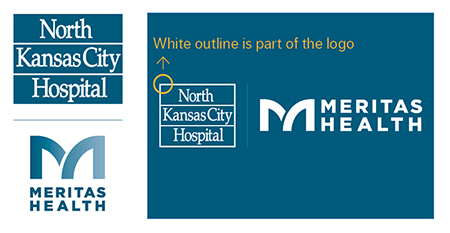
The logo may not be presented in any other color except white and PMS 308 or its CMYK equivalent (100, 18, 8, 50). The NKCH portion of the logo has an embedded white outline, or “lock-up” that frames the logo on colored backgrounds.
Only the Meritas Health portion of the logo may be reversed to white.

Clear Space
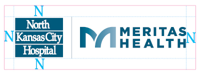
Always maintain a clear space around the logo This space is measured by the height of the “N” in North for vertical space, and the width of the “N” for horizontal. Illustrations, photography, or text must not enter this space.

Minimum Size
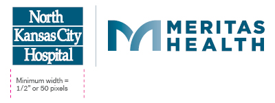
When resizing the co-branded logo, it must be resized as a whole unit and not as separate logos. The NKCH portion of the logo cannot be smaller than 1/2” or 50 pixels in width.
Do not
Do not change the logo’s original artwork. Do not rebuild or distort the logo. Do not change the logo colors. Do not break apart the logo to use the marks separately.

Black and White
The co-branded logo may only be reproduced in various screens of black when media reproduction is limited to black and white printing only.
Questions
If you have questions about how to properly use our logo or other brand elements, please email the Marketing and Communications department.